DiveDeck V2.0 Manual-Browsing and Filtering
Nov 3, 2024
Browsing

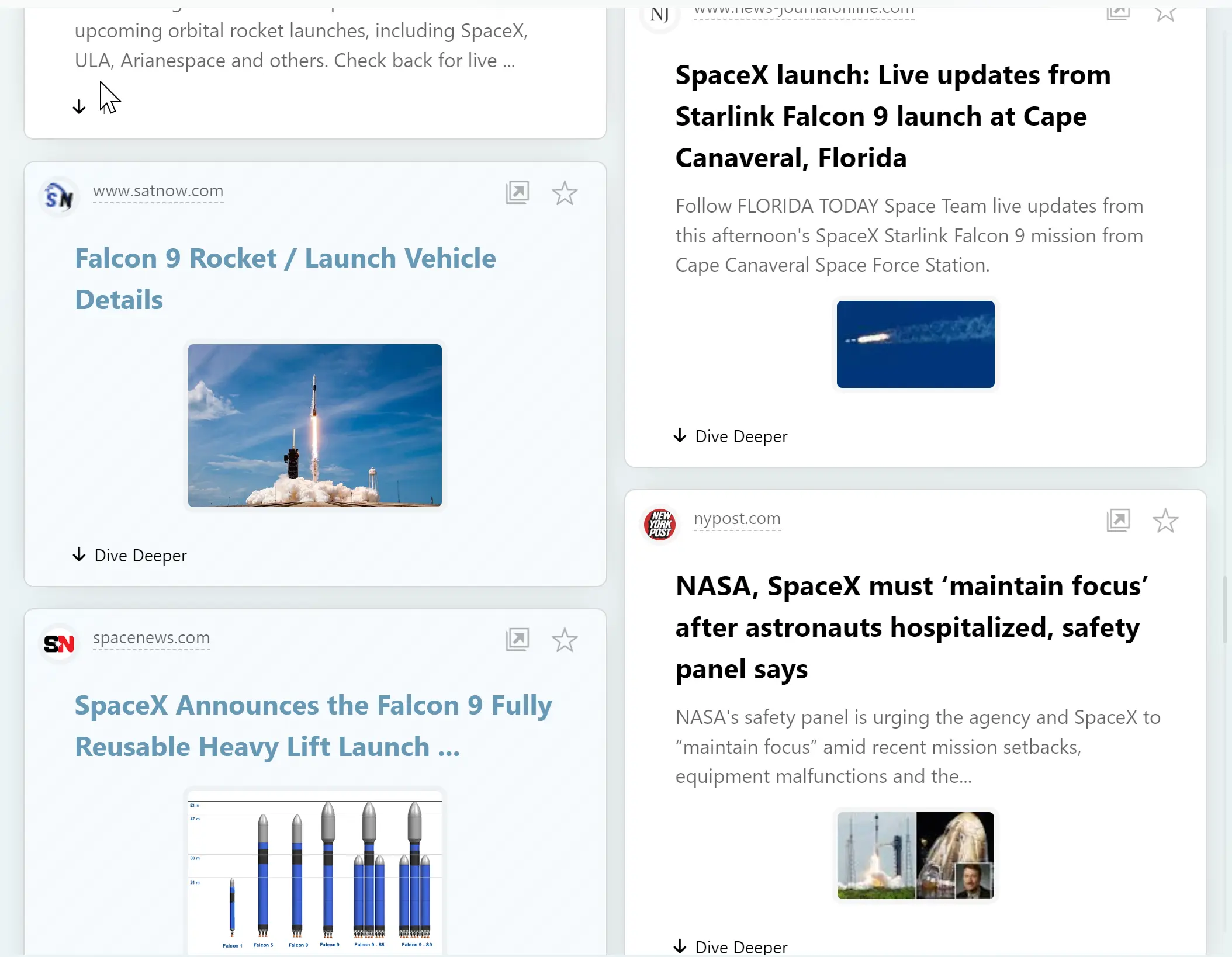
Users' exploration results are displayed in the central area of the main screen, and users can scroll it to browse.

Each exploration's results are grouped under a distinct with a large colorful title.
Users can expand or collapse groups to view specific content, or switch the focused group using the outline list on the left.
A session can consist of multiple groups. Users can start a new session for different projects or directions, containing multiple groups.
Filtering
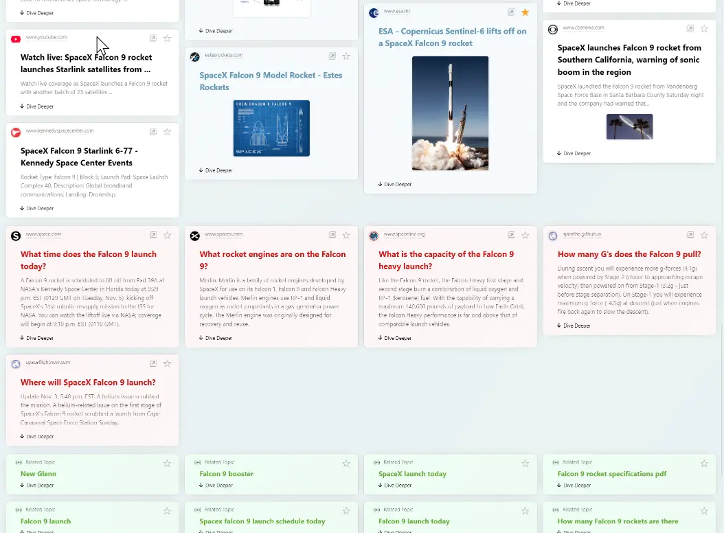
Result cards are distinguished by color and special icons for different content types, making filtering easier.

Color meanings:
Black title card: Regular web search results.
Orange title card: AI-recommended search results.
Red title card: Related questions and answers.
Blue title card: Image resources.
Green title card: Related expandable topics (clicking opens a new search).
Yellow title card: User notes
The filter is located beside the top search bar and appears only when there are items to filter; regular web pages are not included in the filter.

Once the filter is activated, you must exit filter mode before starting a new search.